In Android, if you provide custom background images for buttons, you will lose the pressed and disabled image effects. The common way to fix that is to provide additional images for those states. I’m lazy and I find this inconvenient especially during the prototyping phase of app development.
I’ve always liked the way iOS automatically handles pressed and disabled states for custom button
backgrounds so I made a Button subclass that automatically darkens the background image when the
button is pressed, and makes the background transparent when it is disabled. This is done by using a
custom LayerDrawable
for the button that contains the original background Drawable. The LayerDrawable has to be
stateful
and should change the background properties depending on the current state in
onStateChange().
The full source explains it better:
package net.shikii.widgets;

import android.content.Context;
import android.graphics.Color;
import android.graphics.ColorFilter;
import android.graphics.LightingColorFilter;
import android.graphics.drawable.Drawable;
import android.graphics.drawable.LayerDrawable;
import android.util.AttributeSet;
import android.widget.Button;

/**
  * Applies a pressed state color filter or disabled state alpha for the button's background
  * drawable.
  *
  * @author shiki
  */
public class SAutoBgButton extends Button {

  public SAutoBgButton(Context context) {
    super(context);
  }

  public SAutoBgButton(Context context, AttributeSet attrs) {
    super(context, attrs);
  }

  public SAutoBgButton(Context context, AttributeSet attrs, int defStyle) {
    super(context, attrs, defStyle);
  }

  @Override
  public void setBackgroundDrawable(Drawable d) {
    // Replace the original background drawable (e.g. image) with a LayerDrawable that
    // contains the original drawable.
    SAutoBgButtonBackgroundDrawable layer = new SAutoBgButtonBackgroundDrawable(d);
    super.setBackgroundDrawable(layer);
  }

  /**
    * The stateful LayerDrawable used by this button.
    */
  protected class SAutoBgButtonBackgroundDrawable extends LayerDrawable {

    // The color filter to apply when the button is pressed
    protected ColorFilter _pressedFilter = new LightingColorFilter(Color.LTGRAY, 1);
    // Alpha value when the button is disabled
    protected int _disabledAlpha = 100;

    public SAutoBgButtonBackgroundDrawable(Drawable d) {
      super(new Drawable[] { d });
    }

    @Override
    protected boolean onStateChange(int[] states) {
      boolean enabled = false;
      boolean pressed = false;

      for (int state : states) {
        if (state == android.R.attr.state_enabled)
          enabled = true;
        else if (state == android.R.attr.state_pressed)
          pressed = true;
      }

      mutate();
      if (enabled && pressed) {
        setColorFilter(_pressedFilter);
      } else if (!enabled) {
        setColorFilter(null);
        setAlpha(_disabledAlpha);
      } else {
        setColorFilter(null);
      }

      invalidateSelf();

      return super.onStateChange(states);
    }

    @Override
    public boolean isStateful() {
      return true;
    }
  }

}
To use this, just replace your original button declarations like this:
<Button
  android:layout_width="wrap_content" android:layout_height="wrap_content"
  android:background="@drawable/button_blue_bg"
  android:text="Button with background image" />
To this:
<net.shikii.widgets.SAutoBgButton
android:layout_width="wrap_content" android:layout_height="wrap_content"
android:background="@drawable/button_blue_bg"
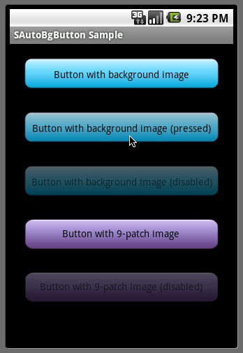
android:text="Button with background image" />Here’s a sample output using this custom button:
The code is also available on GitHub.